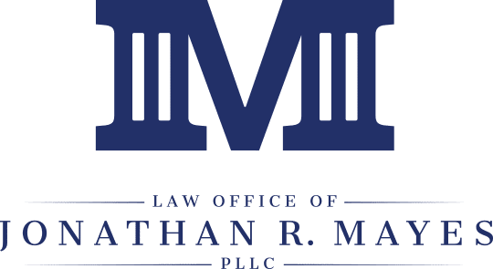
Our idea of a fresh take on a classic symbol.
The Law Office of Jonathan R. Mayes
When Jonathan came to us for help designing his logo, we were immediately impressed by his sincerity and passion. As an attorney it’s important to project integrity, both in and out of the courtroom. Jonathan’s ability to listen, hear both sides, and guide with knowledge and experience demands respect. We wanted his logo to reflect these characteristics.

Bold yet balanced.
With a fresh take on a classic law symbol, we created a bold yet balanced logo that stands out in the crowd to help differentiate Jonathan in a city with over 600 practicing lawyers. The columns bracketing the bold face “M” are perfectly balanced to the right and left. This representation of impartiality and stability conveys what the Law Office of Jonathan R. Mayes is all about.


