

A professional logo for high-end cannabis extract products.
![]() We started by developing a graphic consisting of a single sprout rising from a round-bottom flask. This initial mark was then incorporated into the primary logo, inspired by elements of vintage farm graphics such as rays of sunshine and fields of green crops.
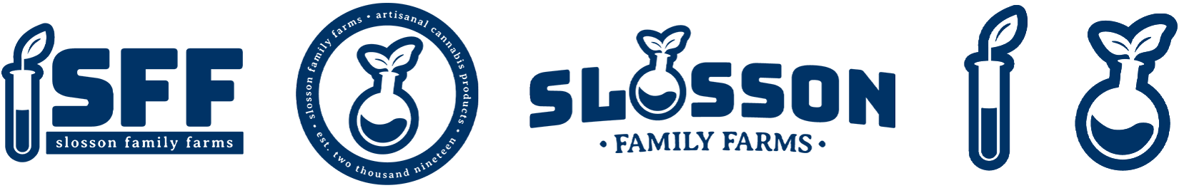
We started by developing a graphic consisting of a single sprout rising from a round-bottom flask. This initial mark was then incorporated into the primary logo, inspired by elements of vintage farm graphics such as rays of sunshine and fields of green crops.
From there, we expanded the logo mark to a build a family of graphics that work together and adapt to a myriad of different uses.
From product labels to shipping boxes, social media profile pictures to vehicle wraps, we designed the system to be highly adaptable to a wide variety of applications. Most importantly, the new Slosson Family Farms visual identity is as friendly and welcoming as the people behind the business.
Ready to get a great logo for your brand?